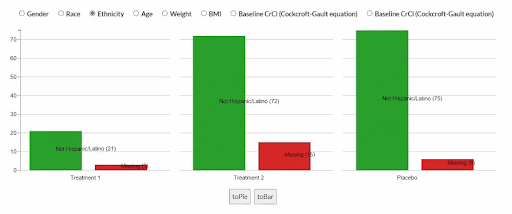
Our tool offers different types of charts that can fit your needs
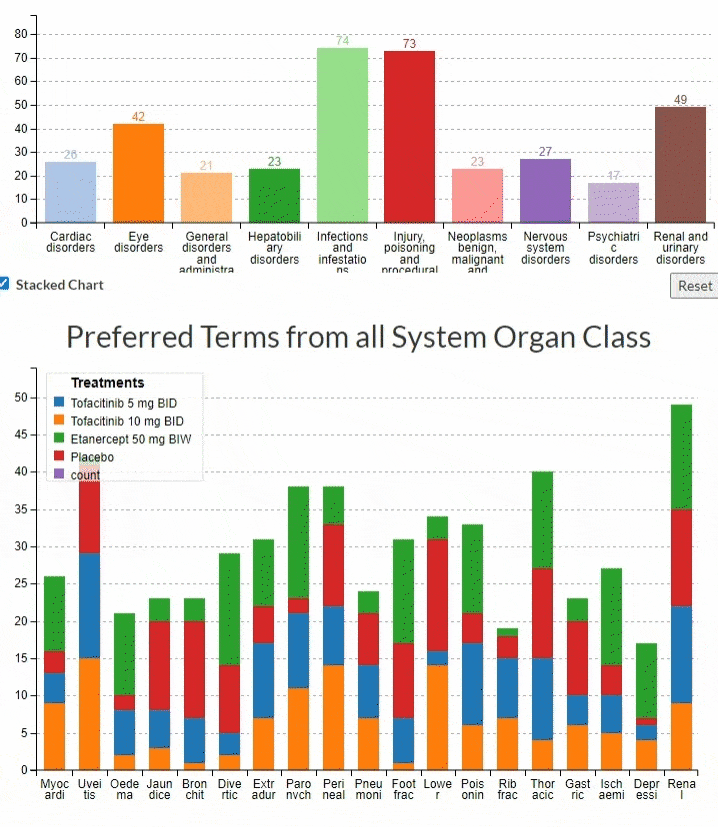
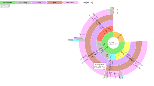
Our application offers a variety of powerful visualization tools, including Line Charts with Area Plots for trend analysis, Grouped/Stacked Bar charts for efficient comparison, Sunburst charts for hierarchical data, Panel Charts for side-by-side analysis, Bar to Pie charts for versatile representation, and Scatter Plots with Traces for correlation insights. These diverse chart options cater to various data presentation needs, ensuring versatility and effectiveness in conveying complex information.

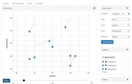
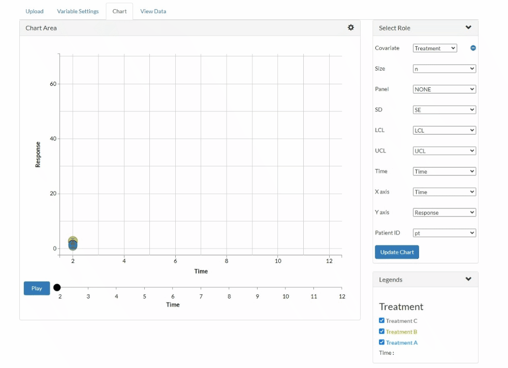
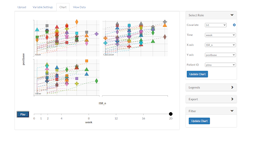
Animated charts
We don’t do just charts. These are animated charts. This means you can get a clear idea about how the data changes over different variables.

Real time updates
Upload your data and generate the chart. Change the variables, settings and other things. You will see that the change is reflected immediately in the charts.
CHART TYPES
Select a chart type to explore:
Need help creating the charts?
How to guide
Have any confusions? Read the how to guide to find out the details of how each of the charts work. This guide has a comprehensive walk through of our application.
Get help
Our expert support team is always there for you. Just reach out to us by clicking on the button below and get all the answers you need for creating the chart of your choice.